Chapter 9 Make them pretty - Weeks 10-11
You should aim to complete this chapter before Week 11's lecture, Semester 1
Over the last couple of weeks you have built histograms, box plots and scatter plots. Probably the three types of data visualisation you are most likely to run into and want to build. But you may have noticed that non of these are particularly aesthetically pleasing. As a rule, data visualisations should always be designed to be attractive, clean, clear and nicely spaced. The purpose of a plot is to provide, you and your audience with a accurate, visually pleasing and easy to interpret representation of your data. Thankfully ggplot2 contains all the tools we need to do this.
Open your tribolium_parasites project in posit Cloud. Create a new script and call it ggplot_fundamentals, save it in your scripts folder and set up your script following the rules in Chapter 4, make sure the tidyverse library is loaded, this contains ggplot2.
Sometimes its can be good to cleanup your Environment a bit, if you run the following command, it will delete everything stored in your environment. Note - you will have to reload your data frames from your data folder. Make sure you saved tribolium_combo to your data folder in Chapter 4 before you do this.
Check your data has loaded correctly. Can you remember how to change treatment from a dbl vector to a factor (fct) (hint in Chapter 8.1)?
9.1 Deconstructing ggplot
To get an idea of how ggplot works we are going to go back over some code you have already run. Try running the following, what happens?
# Making a box plot and saving it in an object
# Call the ggplot function and direct it to your data and define your x axis and y axis
size_differences_boxplot <- ggplot(data = tribolium_combo,aes(x = sex, y = wing_case_size))
print(size_differences_boxplot) # Print the object your plot is stored in to view it
So you have given ggplot your data set and specified the axes. But you haven’t told it how you would like the data to be visualised. So you should see something like this…
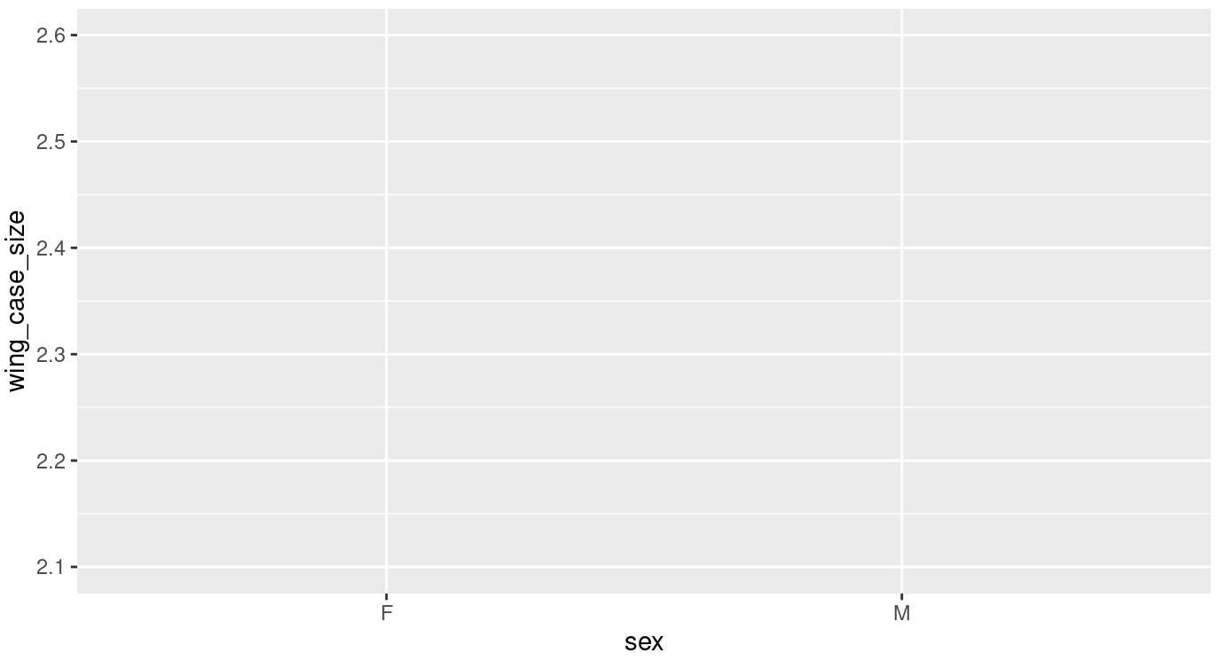
Figure 9.1: The most basic output from ggplot
Now modify the script so that it looks like this…
# Making a box plot and saving it in an object
# Call the ggplot function and direct it to your data and define your x axis and y axis
size_differences_boxplot <- ggplot(data = tribolium_combo,aes(x = sex, y = wing_case_size)) +
  geom_boxplot(aes(fill = treatment)) # Tell ggplot that you want it to build a box plot coloured by treatment
print(size_differences_boxplot) # Print the object your plot is stored in to view it
Note the +, this is essentially another way of piping information from one function into the next. You could also have added fill = treatment to the first line within this chunk within aes().
Your figure should look like this…
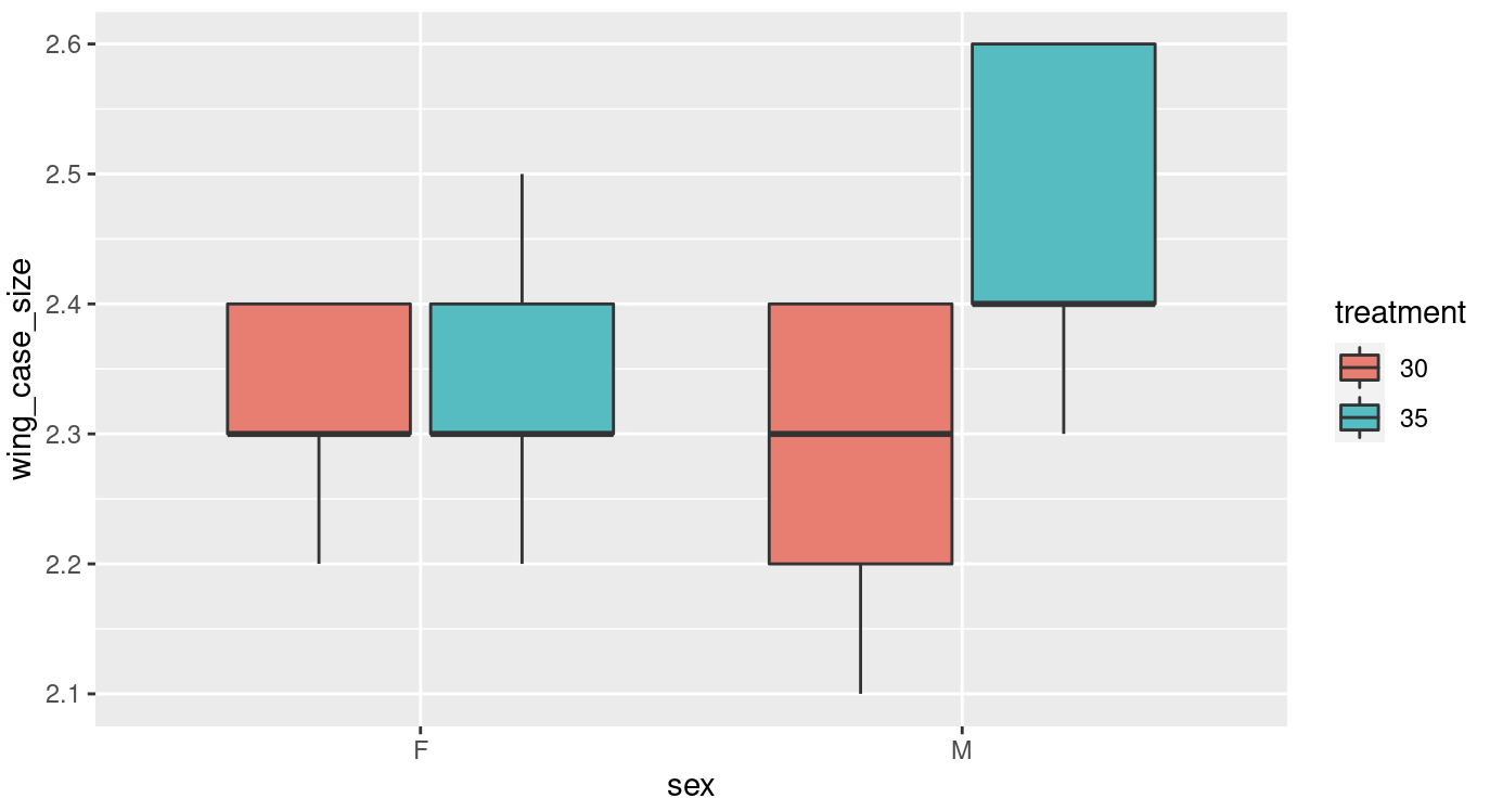
Figure 9.2: A basic ggplot box plot output
Have a look at this figure, is there anything you would change, to make it more visually appealing or clear?
Here are some things I would change:
- Labels
- Colour scheme
- Spacing
- Theme
We will look into labels and colour scheme this week and spacing and theme next week.
9.2 Labels
Clear accurate labeling is essential in the sciences, be it when your in the lab labeling up your samples or creating data visualisations.
In our current plot both our x and y axis could do with some relabeling, just because we dont use capitals when coding doesn’t mean we don’t follow the normal rules of English grammar when presenting data. Try adjusting your code so that it looks like the following;
# Making a box plot and saving it in an object
# Call the ggplot function and direct it to your data and define your x axis and y axis
size_differences_boxplot <- ggplot(data = tribolium_combo,aes(x = sex, y = wing_case_size)) +
  geom_boxplot(aes(fill = treatment)) + # Tell ggplot that you want it to build a boxplot
  labs(x = "Sex", y = "Wing case size (mm)\n") # Adjust your x and y axis labels
print(size_differences_boxplot) # Print the object your plot is stored in to view it
Note the \n on your y axis label. This simply adds a new line to the label and spaces it nicely away from the y axis.
This looks a bit better but our legend is still not very well labeled. Adjust your labs function so that it reads labs(x = "Sex", y = "Wing case size (mm)\n", fill = "Treatment"). This will change the label for your legend.
Our labels still aren’t quite right, I don’t like the abbreviations on the x axis and our legend could still use some work as there are no units given for the treatment temperatures. Try these changes;
# Making a box plot and saving it in an object
# Call the ggplot function and direct it to your data and define your x axis and y axis
size_differences_boxplot <- ggplot(data = tribolium_combo,aes(x = sex, y = wing_case_size)) +
  geom_boxplot(aes(fill = treatment)) + # Tell ggplot that you want it to build a boxplot
  labs(x = "Sex", y = "Wing case size (mm)\n", fill = "Treatment") + # Adjust your legend and x and y axis labels
  scale_x_discrete(labels = c("Female","Male")) + # Rename the categories on the x axis
  scale_fill_manual(labels = c("30°C", "35°C")) # Rename your treatments
print(size_differences_boxplot) # Print the object your plot is stored in to view it
Note that the scale x discrete and scale_fill_manual functions simply rename things in the same order as you present them, make sure you label your categories accurately or this can make a big mess later on.
If you try to remake your plot at this stage you will get the following error:
Error in `f()`:
! Insufficient values in manual scale. 2 needed but only 0 provided.
Run `rlang::last_error()` to see where the error occurred.
This is because scale_fill_manual is also expecting some instructions on how to colour your boxplot. You will need to complete Chapter 9.3 before you can successfully remake your boxplot.
9.3 Switching up colours
The colours of your boxes are the default colours given by ggplot2. We can modify these to make our plot look a bit more pleasing. Try editing the scale_fill_manual function to this scale_fill_manual(labels = c("30°C", "35°C"), values = c("cornflowerblue", "coral")). Run it and see what happens to your plot.
What do you think of your new plot now? Do you think the changes to labels and colours are an improvement?
R has lots of colours, take a look at the linked reference lists and have a play with changing up some of your colours.
Colour can be a really useful tool to employ when making your plots visually appealing, however make sure you are mindful that some colour pallets can be difficult for some people to interpret. There are however, some really good tips out there for making sure your figures are accessible to everyone.
9.5 References
Wickham, Hadley, Mara Averick, Jennifer Bryan, Winston Chang, Lucy D’Agostino McGowan, Romain François, Garrett Grolemund, et al. 2019. “Welcome to the tidyverse.” Journal of Open Source Software 4 (43): 1686. https://doi.org/10.21105/joss.01686.
Wickham, Hadley, Winston Chang, Lionel Henry, Thomas Lin Pedersen, Kohske Takahashi, Claus Wilke, Kara Woo, Hiroaki Yutani, and Dewey Dunnington. 2021. Ggplot2: Create Elegant Data Visualisations Using the Grammar of Graphics. https://CRAN.R-project.org/package=ggplot2.